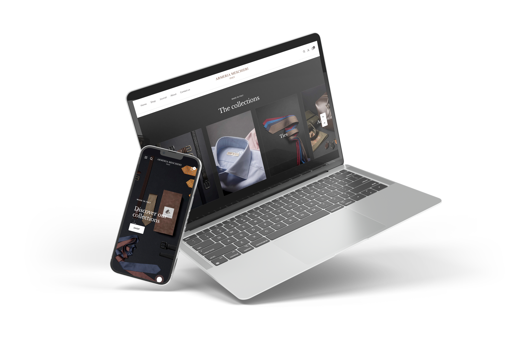
Redesign & rebranding of the e-commerce
The project description
- ObjectiveWebsite and brand redisign
- Published23 June 2022
- The TeamUX/UI Engineer (me), photographer
- IndustryLuxury clothing
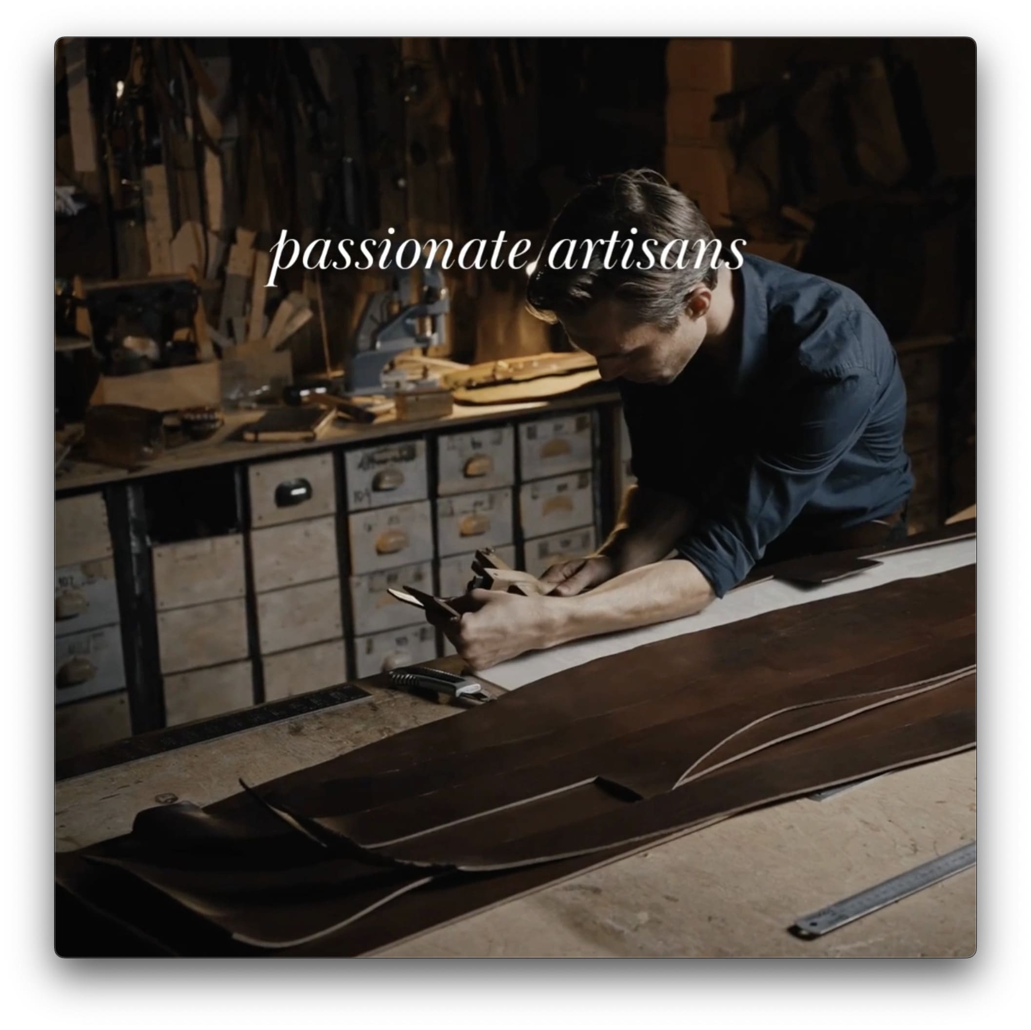
Armeria Meschieri is an Italian brand that provides high-quality artisanal cloths. Their values are based on sustainable and timeless Made in Italy products.
The business owners would like to conduct a rebranding and build a new e-commerce to reflect and demonstrate better their high-level luxury brand.
armeriameschieri.comThe process
Analysis of the previous website and brand analysis
Main identified problems with the previous website
New ideas to overcome the previous problems
Analysis of the completed project
Brand and website analysis
Despite the high quality of Armeria Meschieri products, due to the previous website's poor design, visitors needed help understanding the quality and value of the company's products. This often led to customers not concluding their e-commerce purchases.
The challenges
After a careful and detailed analysis of the website and brand cundected by myself, I discovered the following problems
The point is..
The website must reflect the luxurious level Armeria Meschieri offers with its products. To convince its customers of the product's quality and thus lead them to purchase.
My solutions
I went for a website revamp based on the most recurring issues I found during the heuristic evaluation. Moreover, I have followed some specific approaches that this NN/g article suggests to follow for luxury brands that can be used to deliver a high-quality e-commerce experience without sacrificing their values and principles.
- Exclusivity and rarity
- Attention to detail
- Distinctive identity and style
- Deep personal connections
Therefore, I focused my improvement suggestions on the following points:
Issue 1: no perception of a luxury brand
Solutions: rethinking the brand with the main changes in fonts, colours and pictures.
Issue 2: poor navigation experience
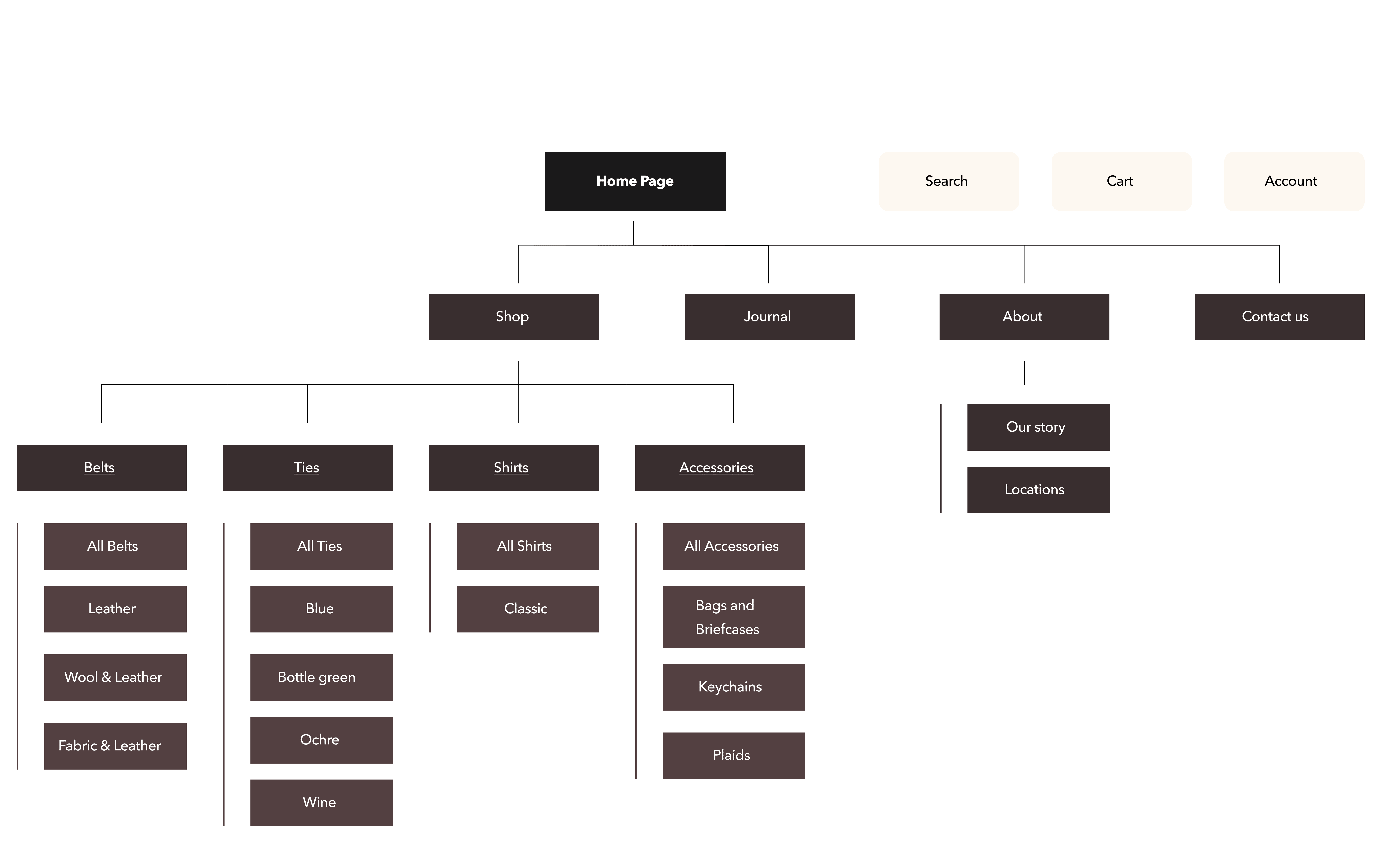
Solutions: make the sitemap and navigation flow clearer and better categorise the products and their subpages.
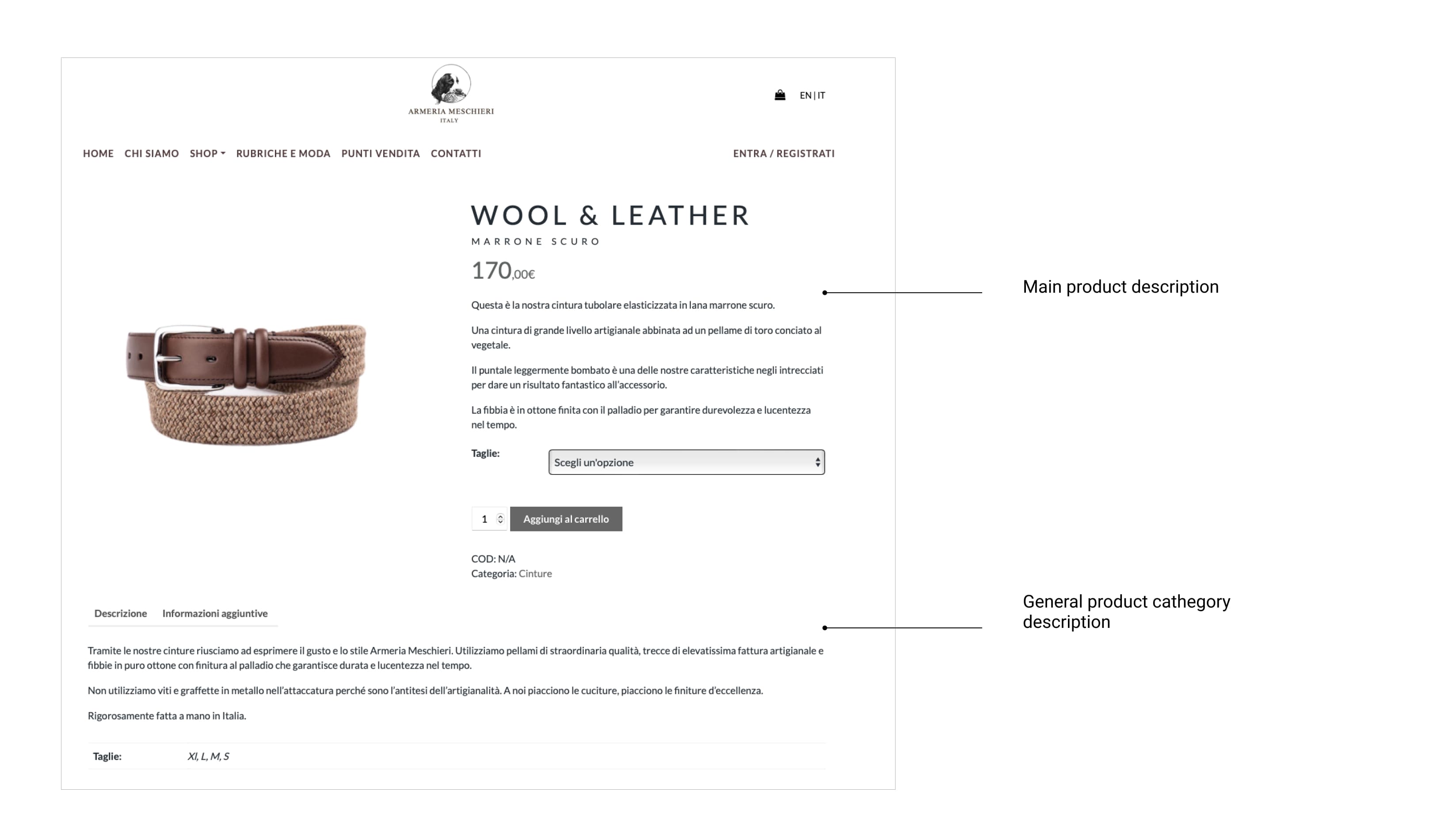
Issue 3: insufficient product description
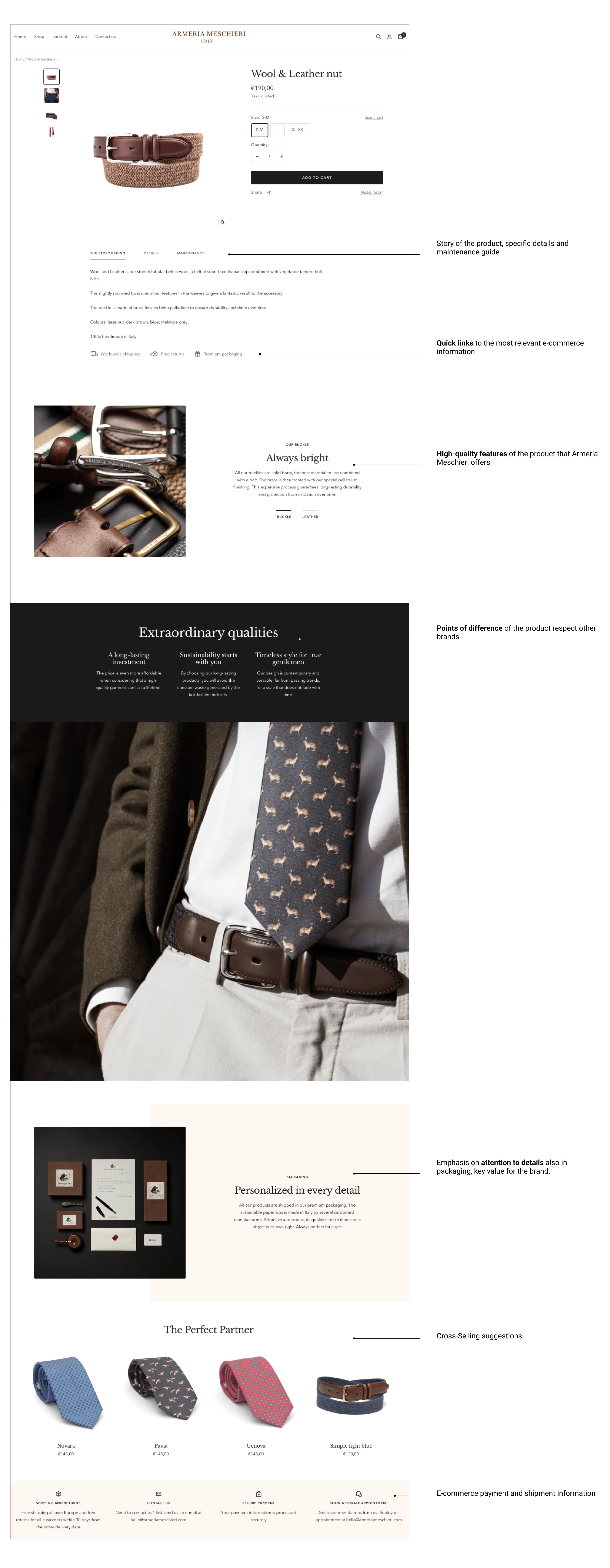
Solution: detailed product descriptions with a new story of the product, point of difference to other brands, and emphasis on the brand's attention to the details.
Wear a story, write your story
Refreshed fonts and color palette
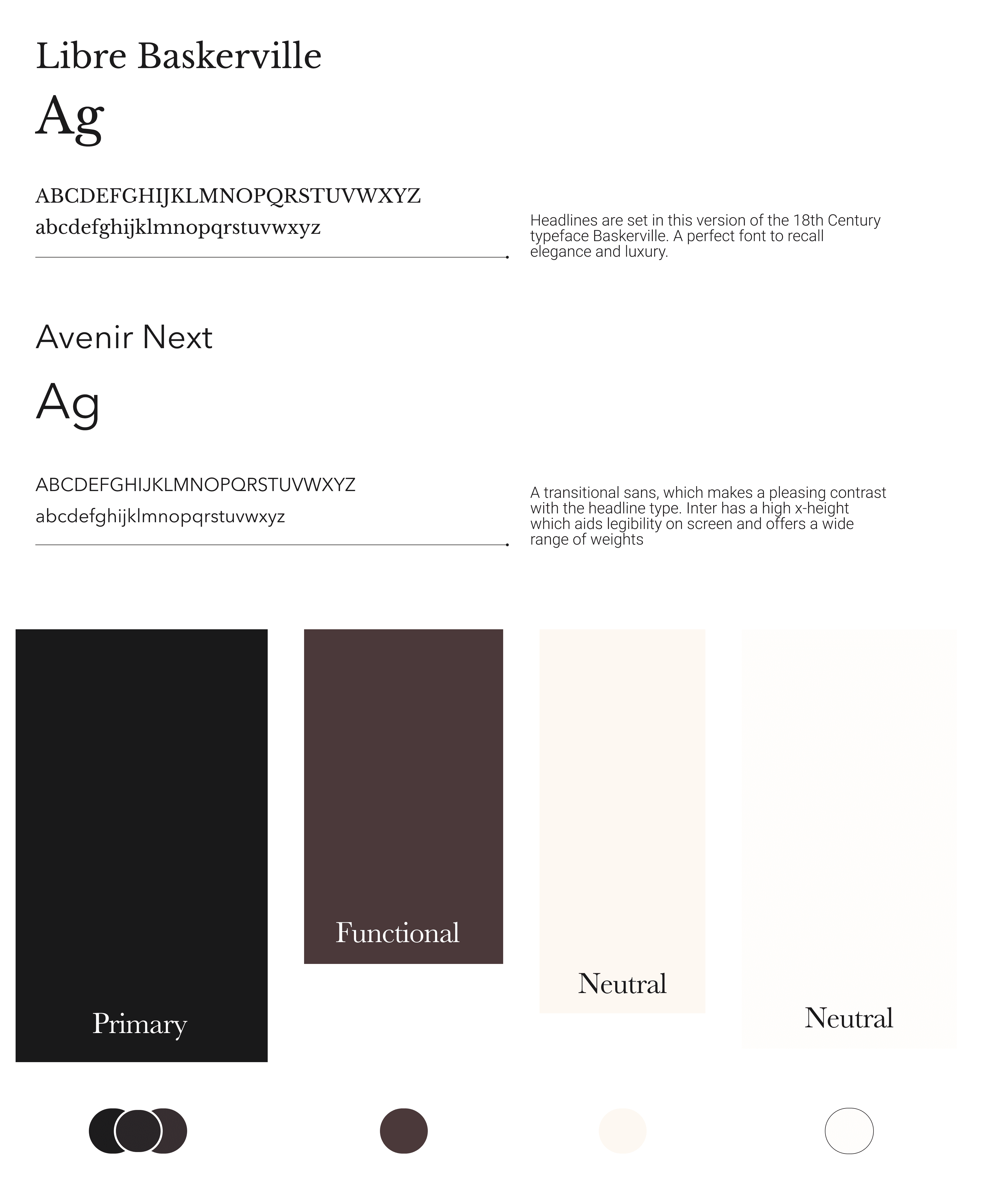
- Primary: Eerie black for luxury and elegance.
- Functional: Dark Puce recall to the main leather focus on the products.
- Neutral: Creamy off-white to give a clean and sophisticated feeling.
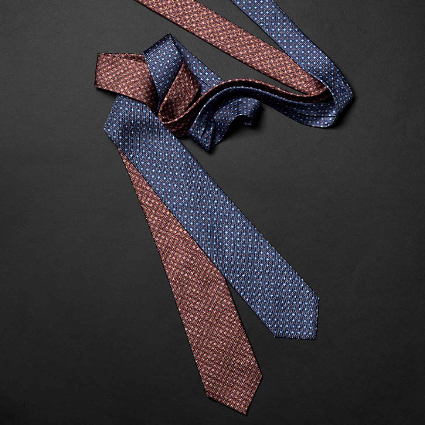
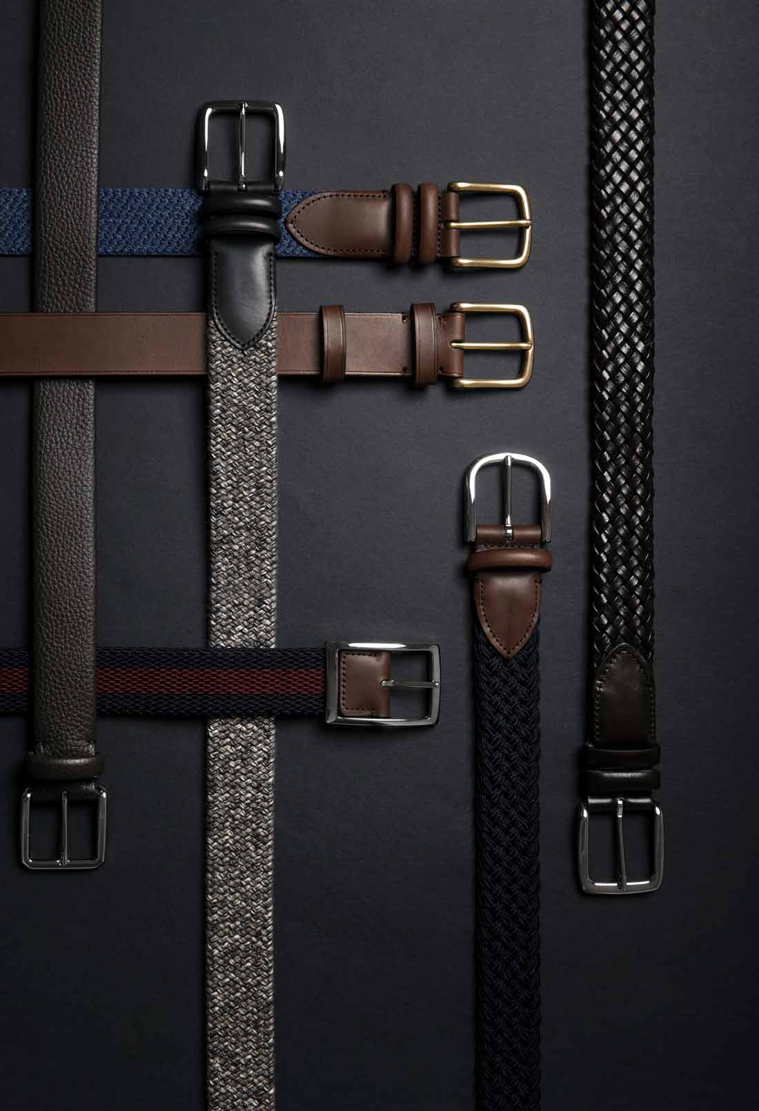
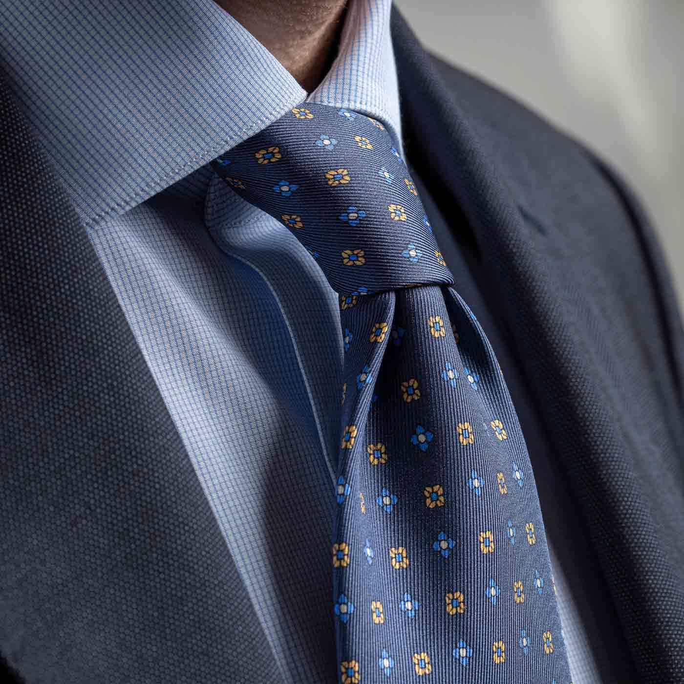
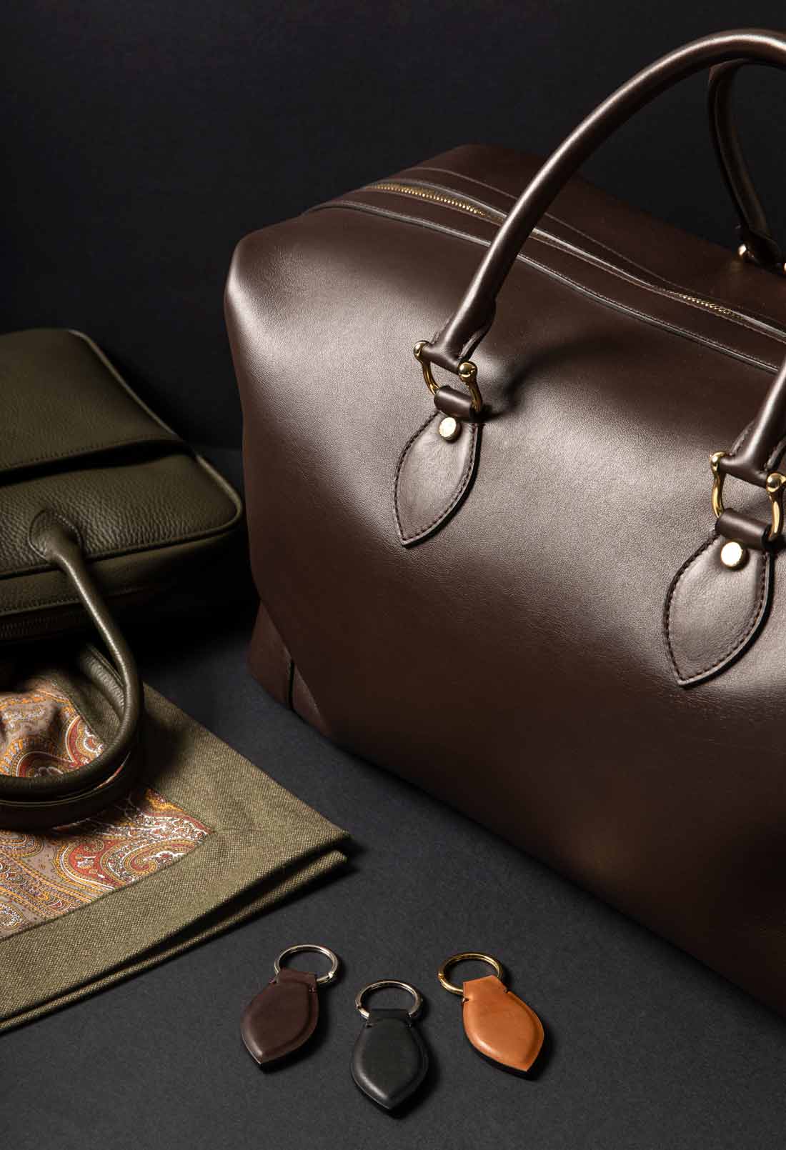
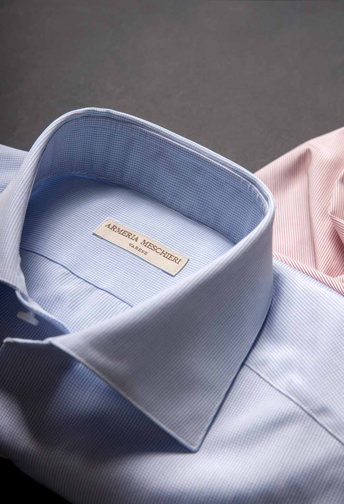
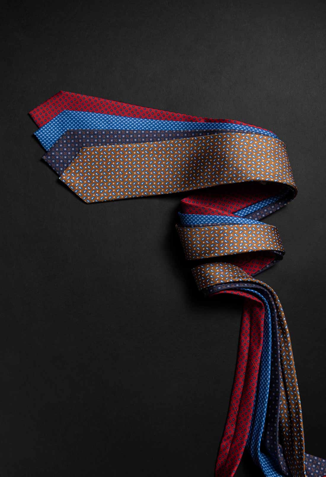
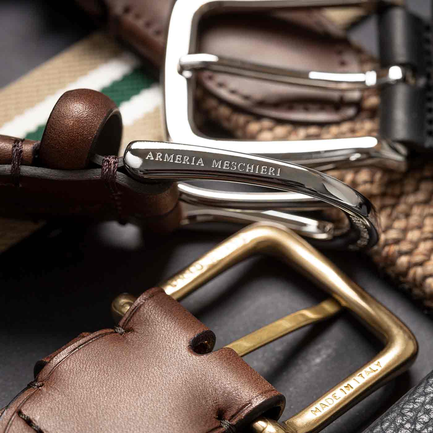
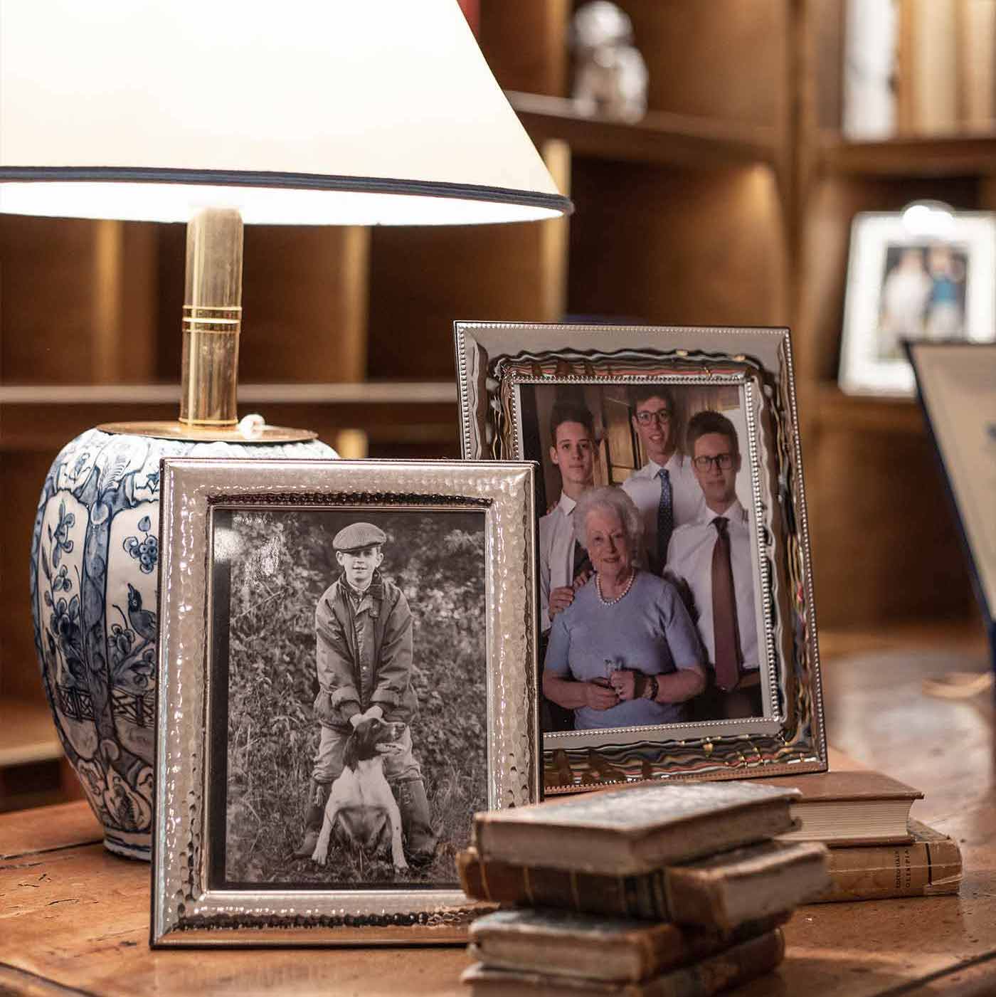
High-quality photos
The navigation
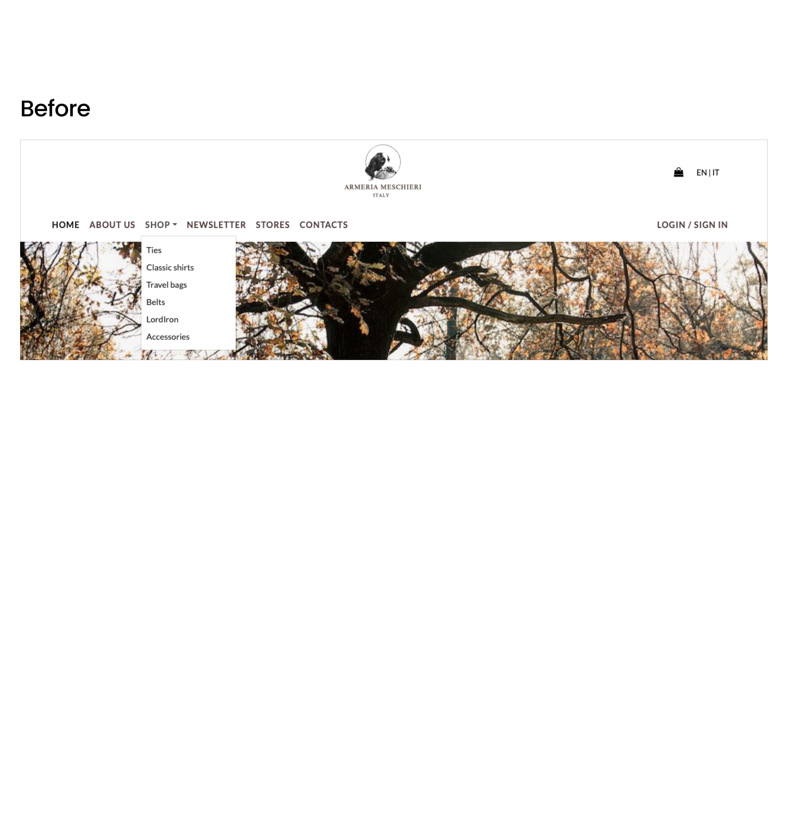
The website presents two poorly organized headers and offers scarce navigation within the catalogue.
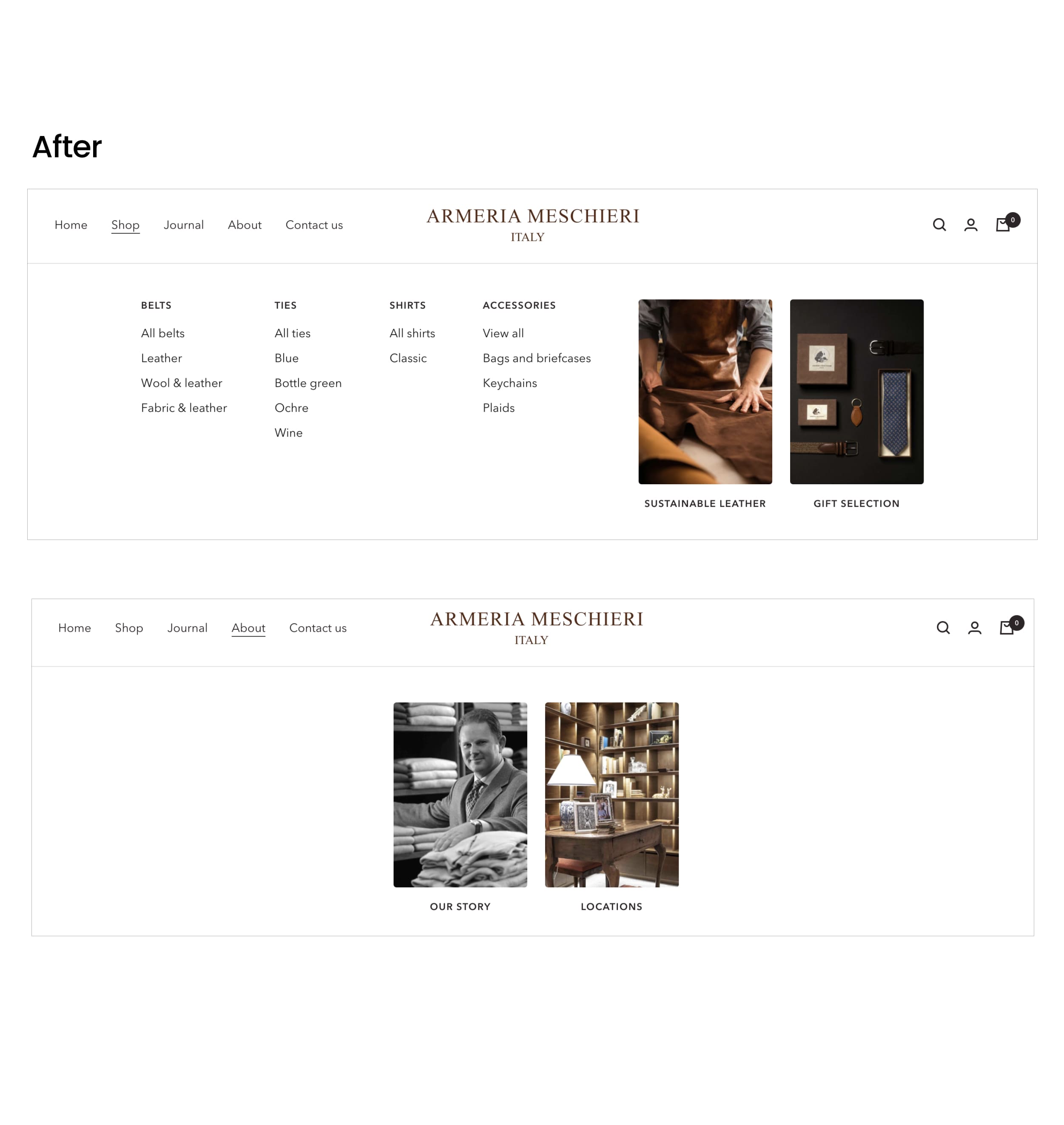
I have created dedicated subpages for each product. I have also introduced megamenu to make special groups stand out more.
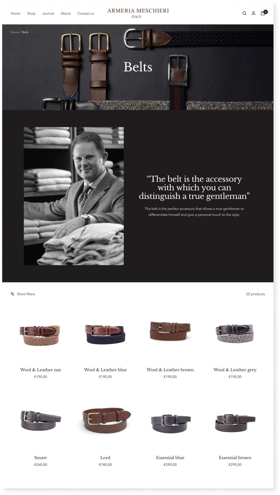
Products sections and detailed product page
Before
After
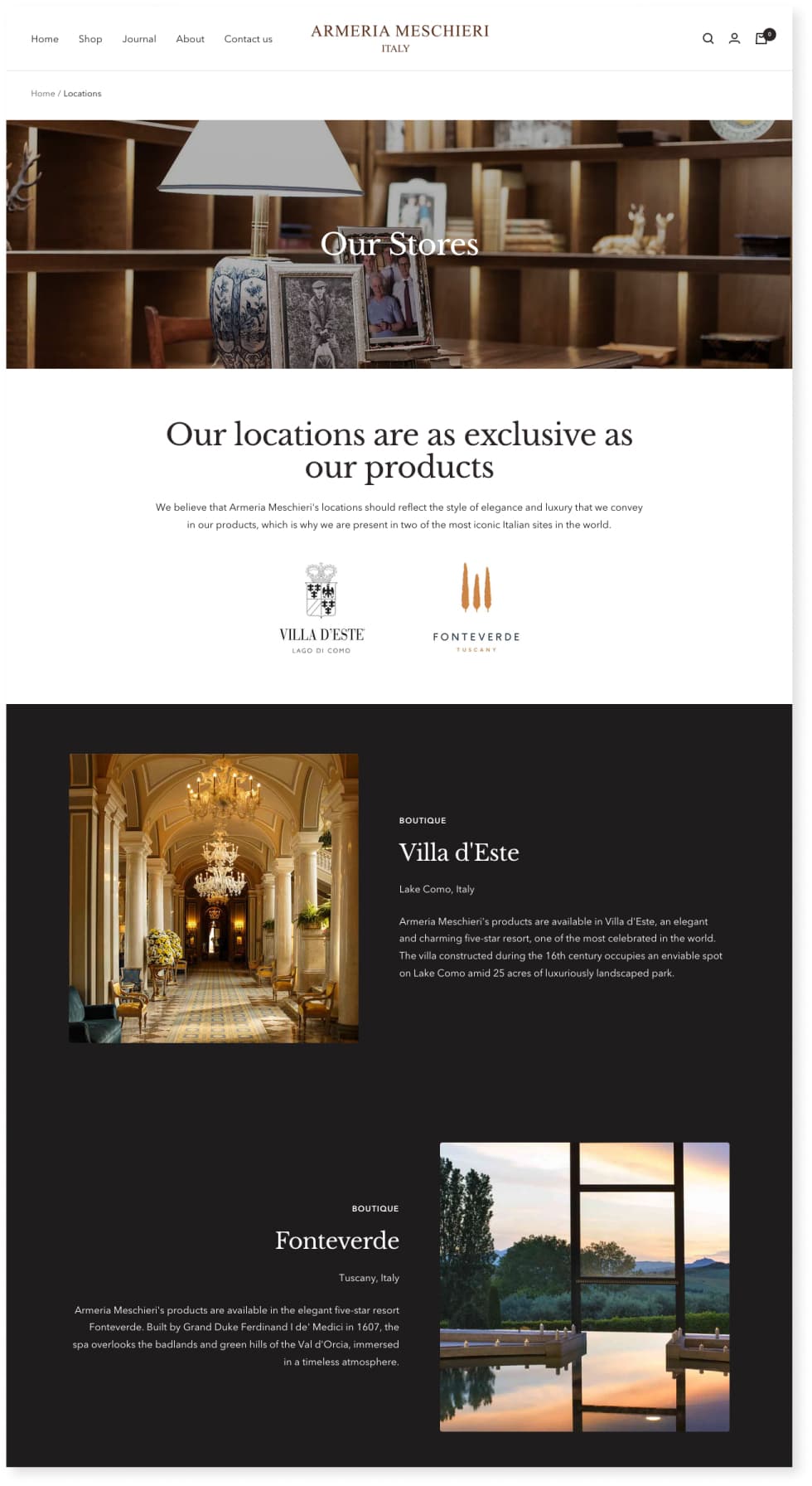
some other redesigned pages..
have a look with your eyes
Challenges faced during the project
The rules for luxury brands are very different from those for other retailers — mainly because the decision-making process for luxury purchases is not practical but intensely emotional. Luxury marketing relies heavily on establishing and protecting a brand narrative — particularly around quality and exclusivity.
Shopify limitationsDue to the Shopify tech limitation, I had to correct and rethink a few decisions, always meeting the business, users and tech needs within the tight timeline and budget.
What I have learned
My favourite part of this case study was the scouting phase of the luxury market. Emphasising with Armeria Meschieri brand, trying to understand the theories on luxury marketing and the decision-making process of the users to create emotional and efficient e-commerce.
