UX/UI improvements on MonetDB cloud interface
The 10 seconds case 👇


Of course, the whole project took a "little" more than just those 10 seconds.
So, how did I make the decisions?
Continue reading the case to discover more.
The "a bit longer" case 👇
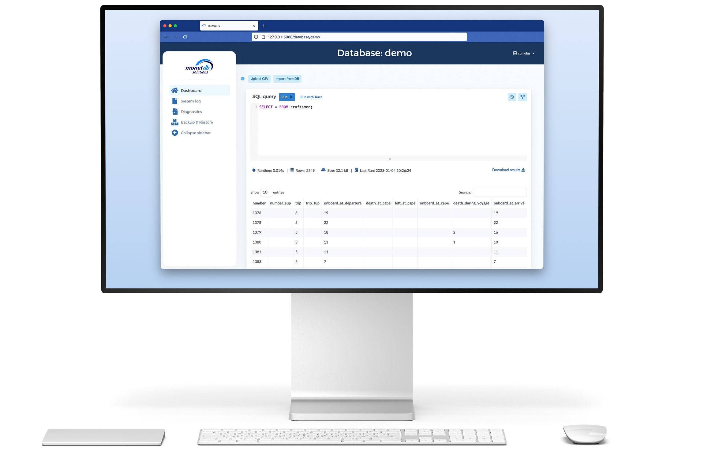
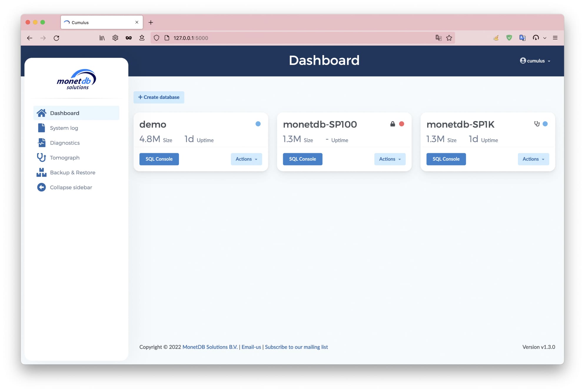
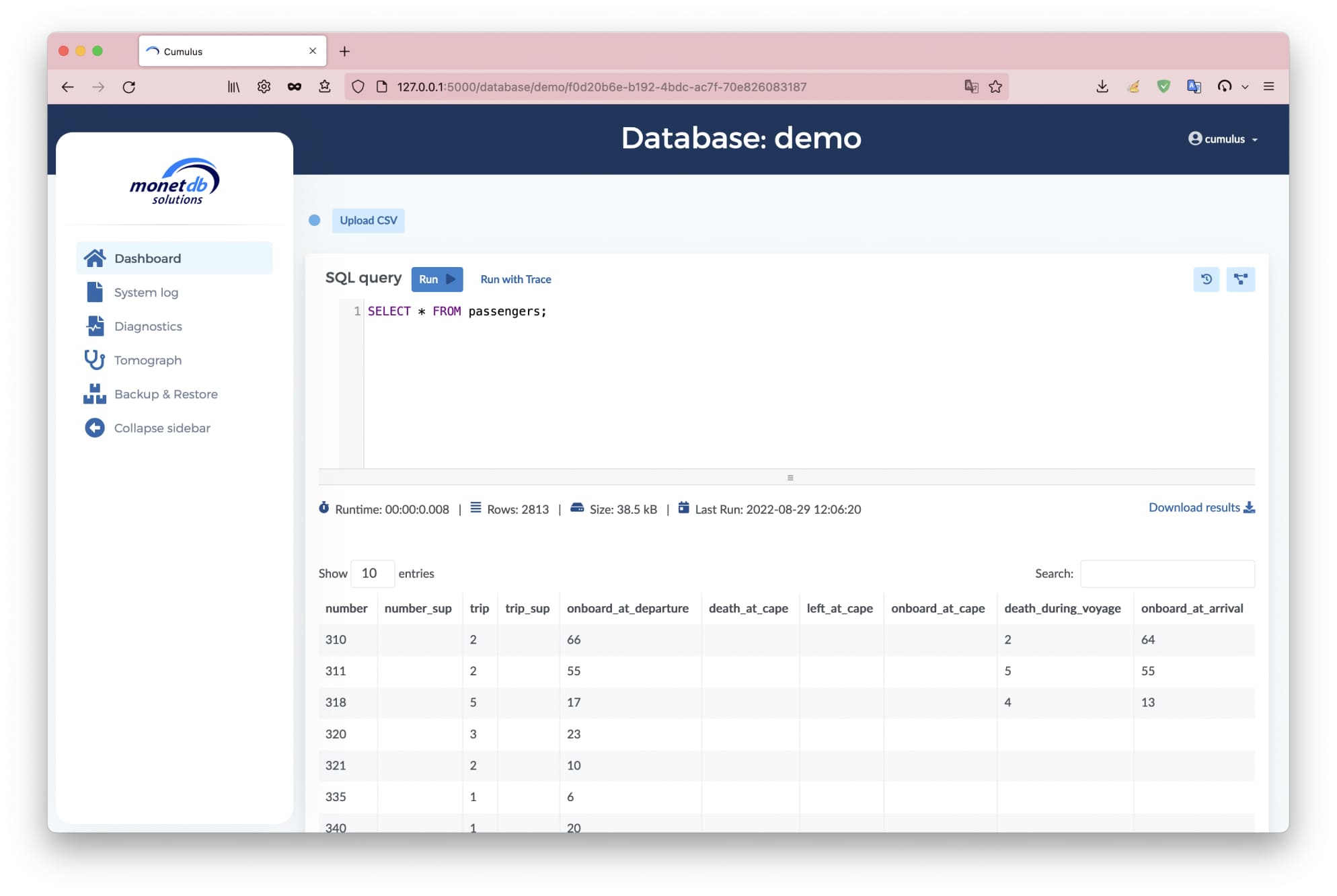
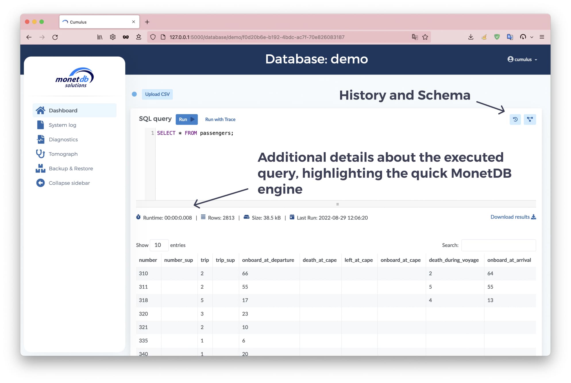
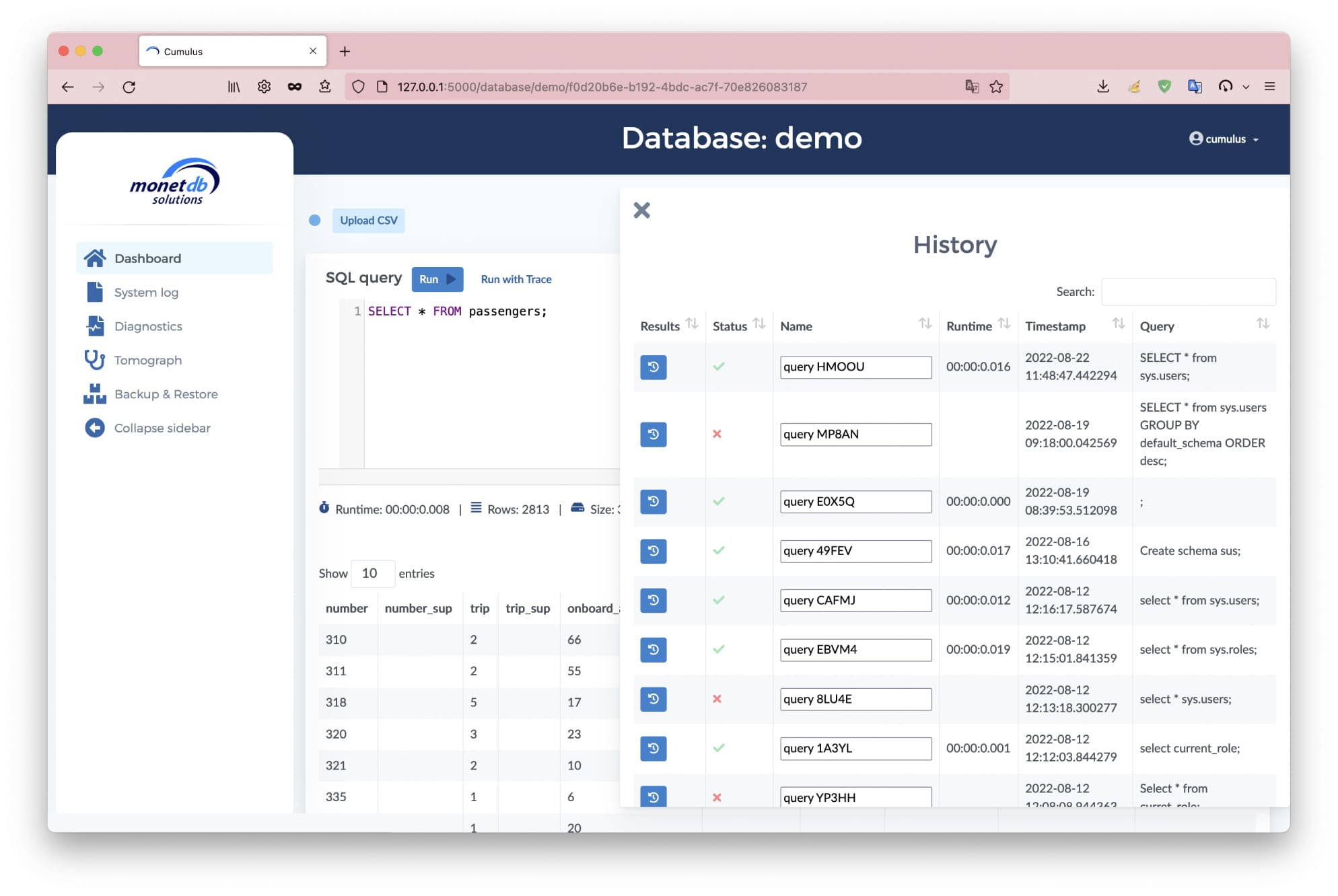
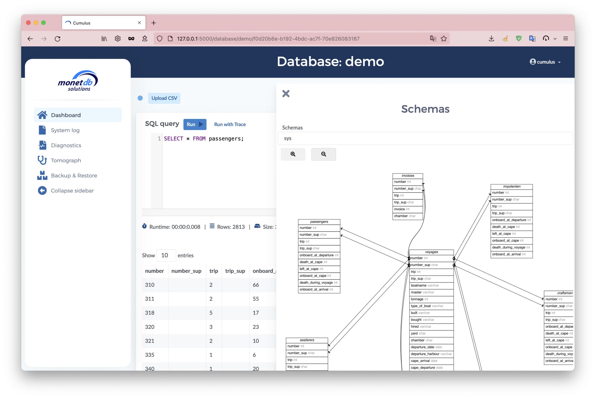
Manage your MonetDB databases with a modern interface
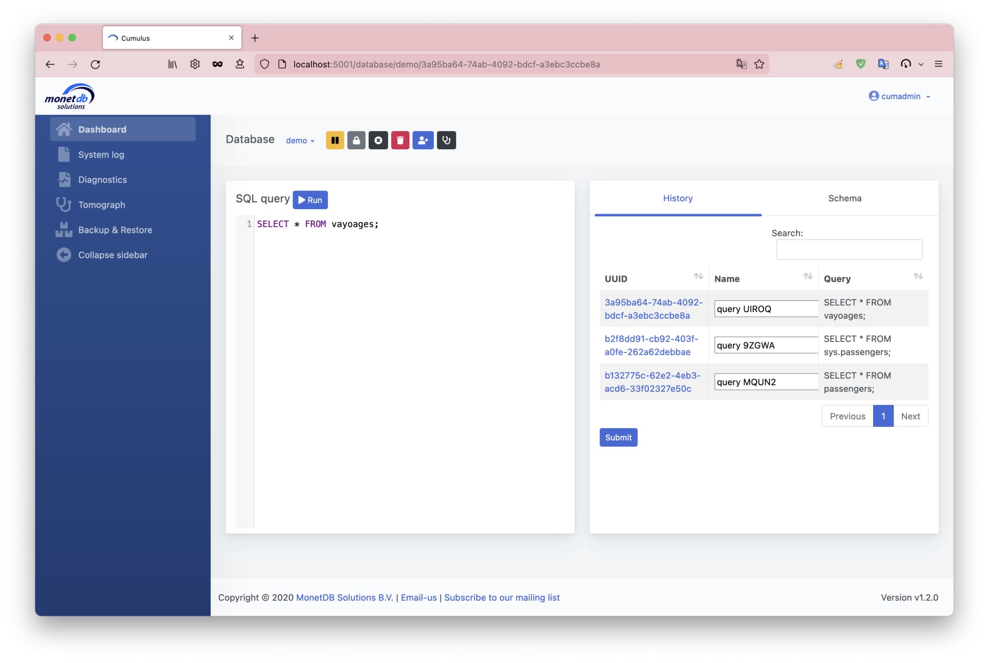
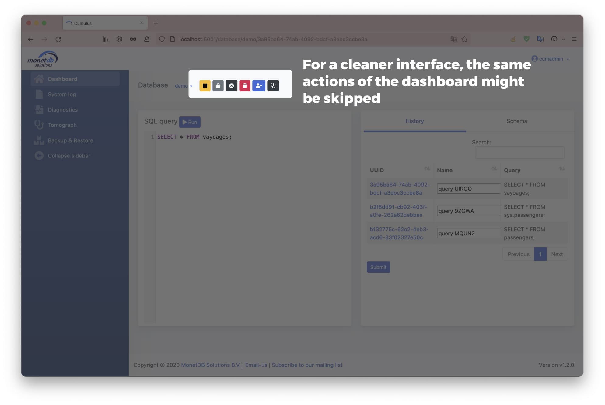
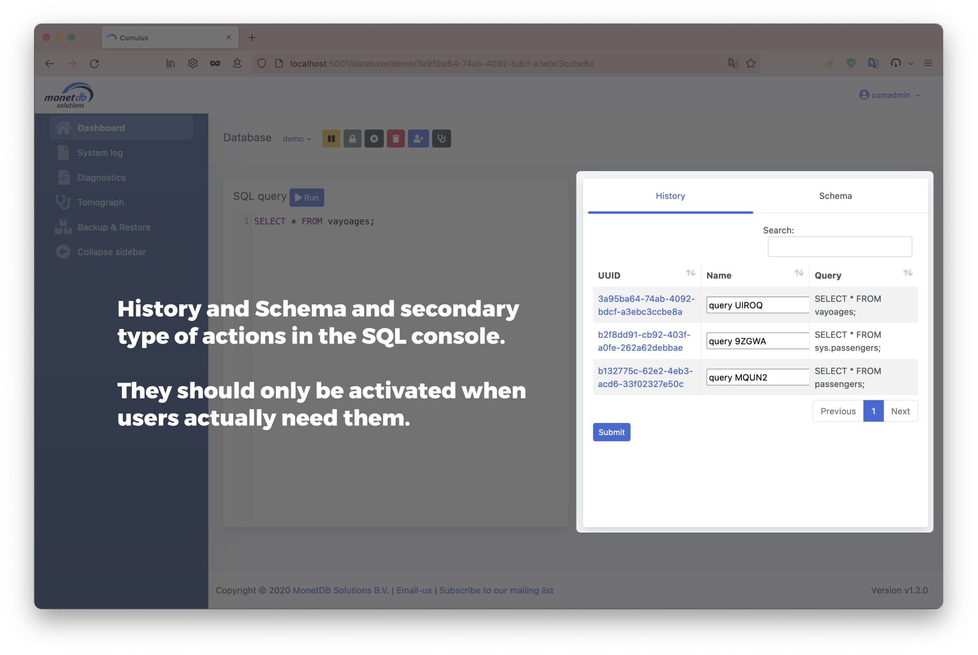
MonetDB Cloud Interface is a Cloud admin tool to manage MonetDB databases. Without considering the application's intended consumers, the first prototype of the web application was created using a conventional design template. Resulting in a bland interface with numerous usability issues and a stock interface.
My responsibility in this project was to improve the UX/UI of the application by compensating for the lack of a poor user-centered design.
The team comprised one UX/UI Designer (me) and one Backend Engineer.
Improve the web application
UX/UI Designer
Figma, HTML, CSS, JS
Usability study with Think Aloud protocol
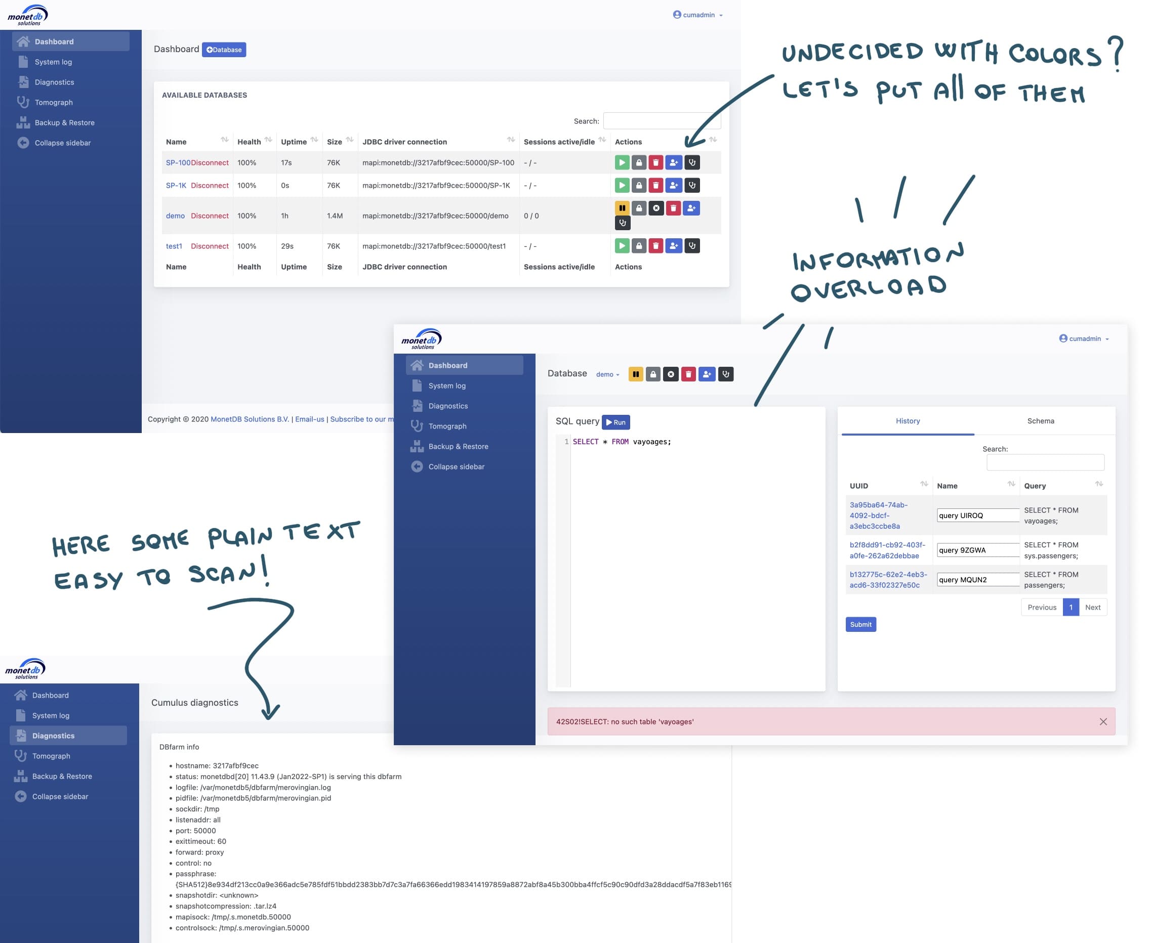
Old pages problems
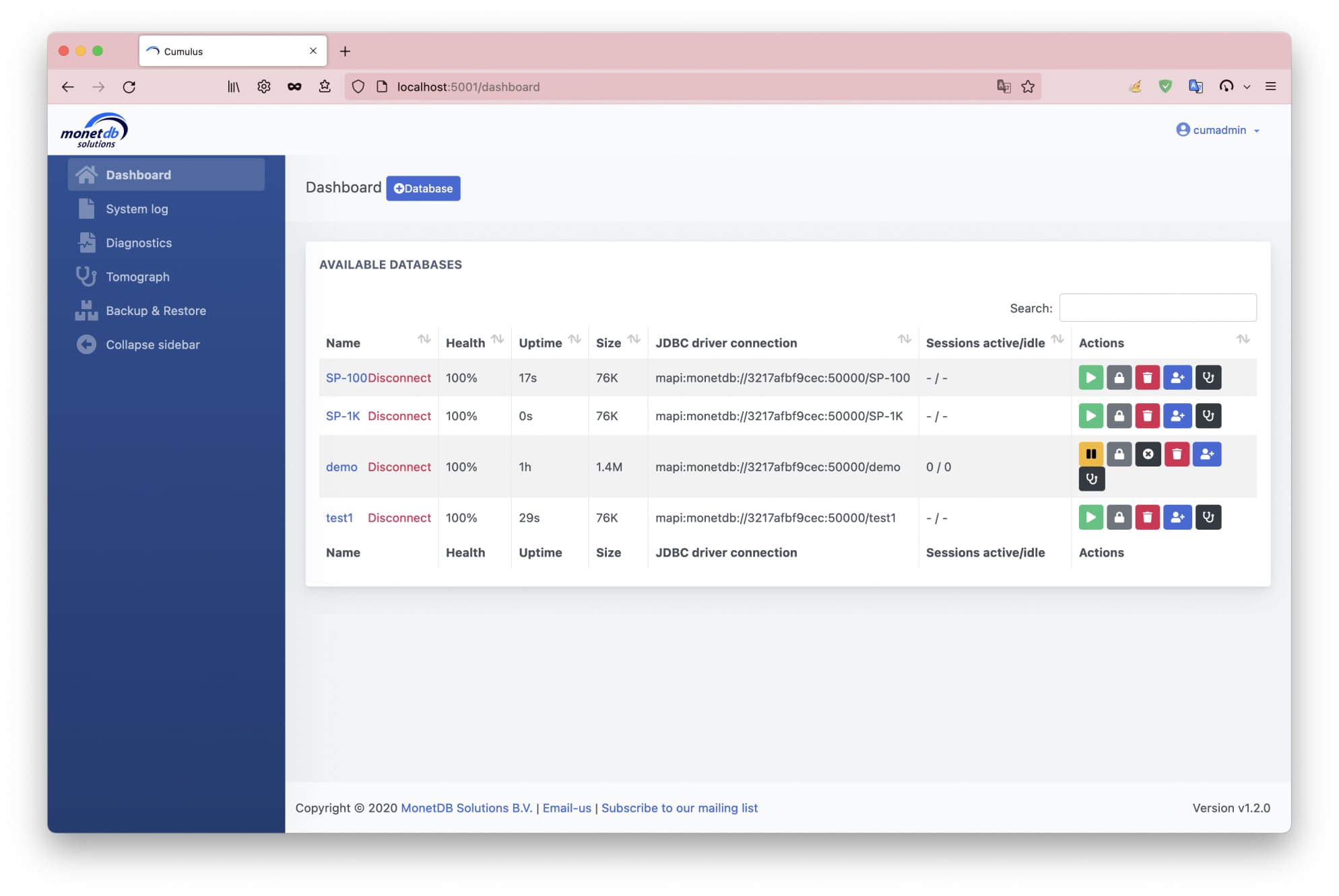
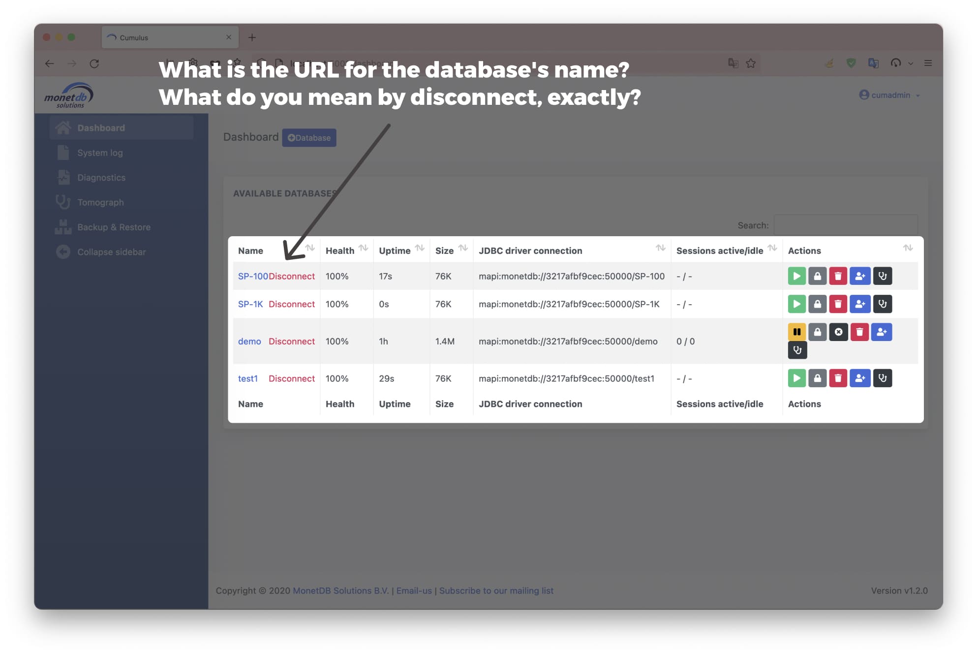
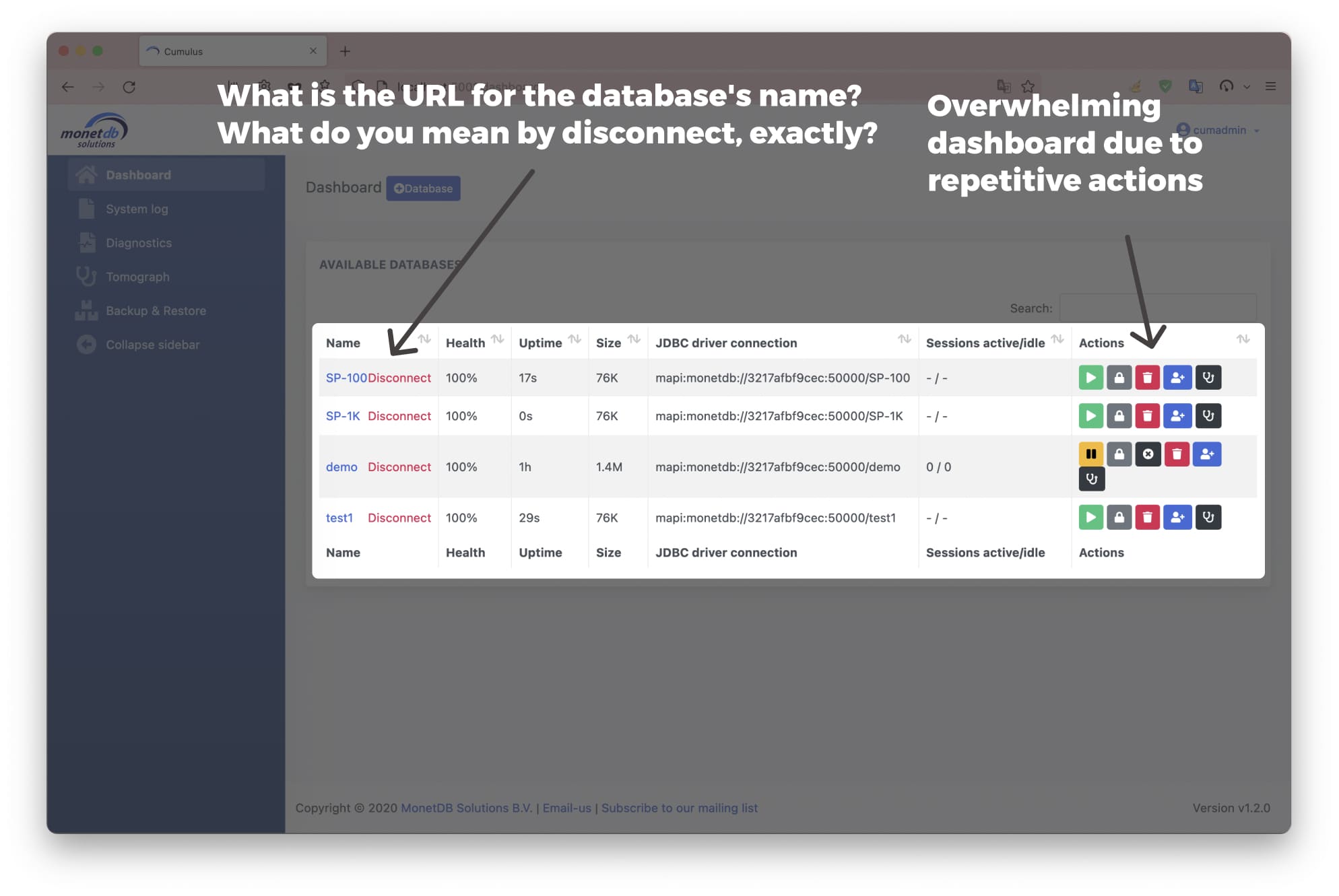
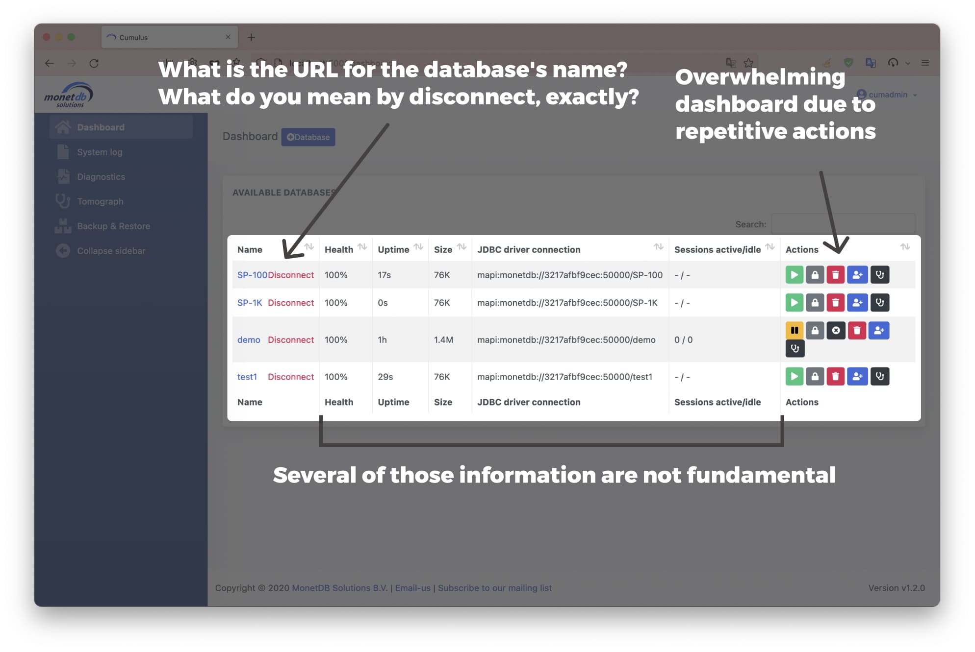
Due to the creation of the prototype without considering the final users, it end up being too complex and with too technical terms that could bring users to confusion.
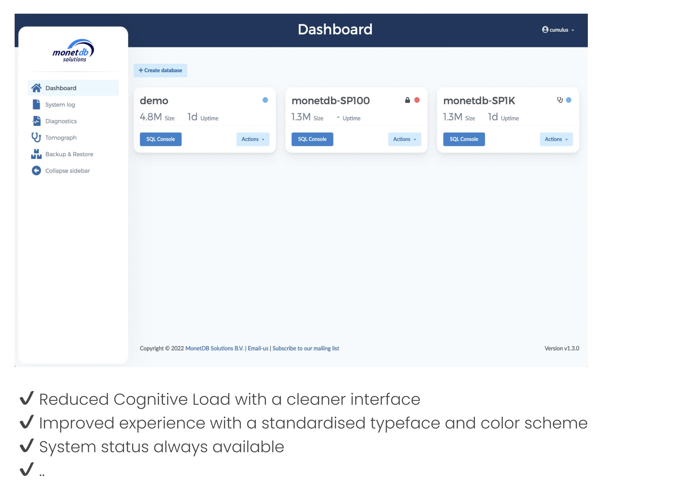
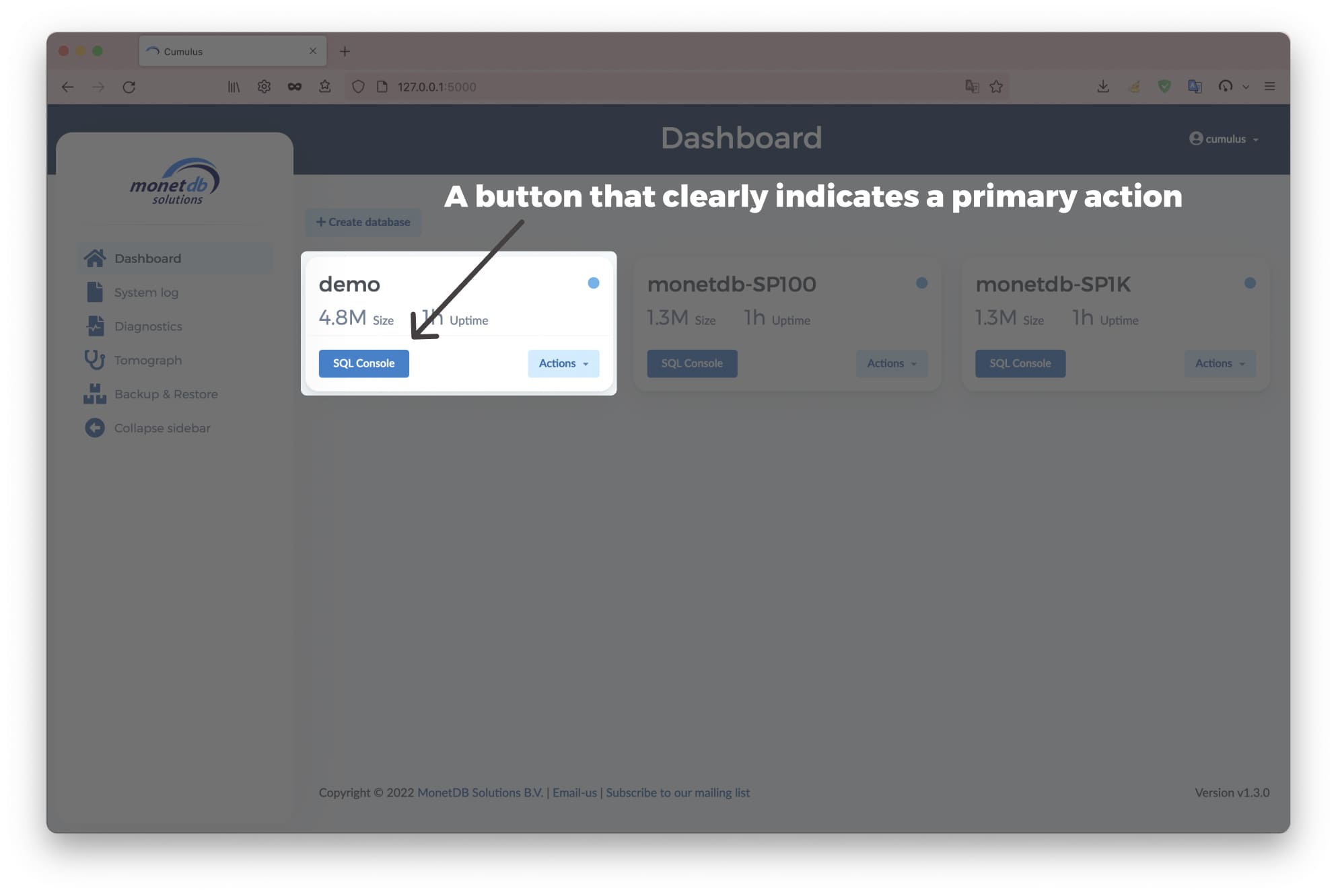
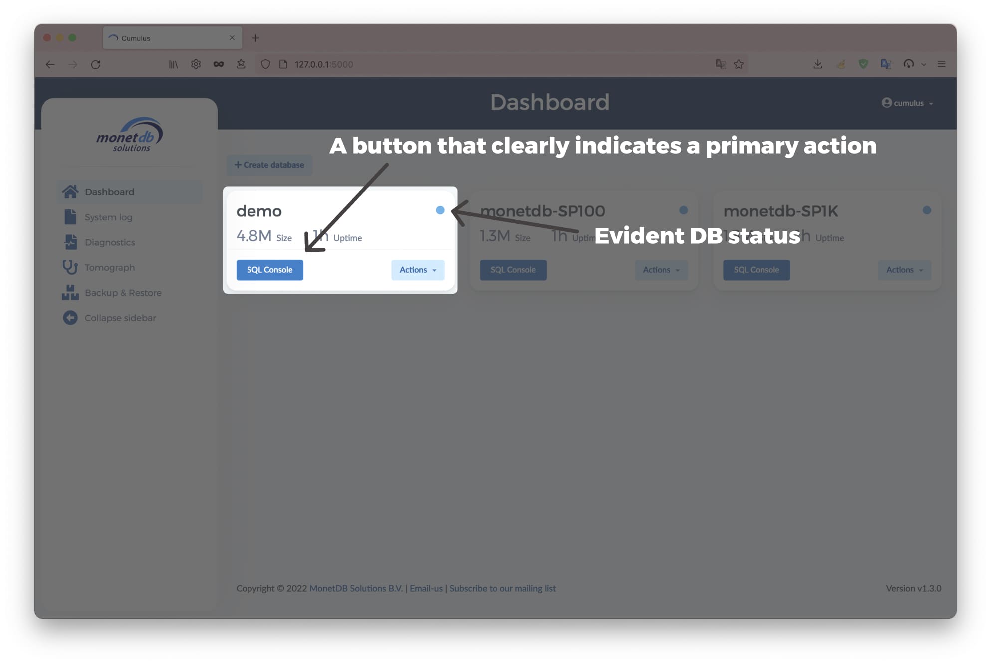
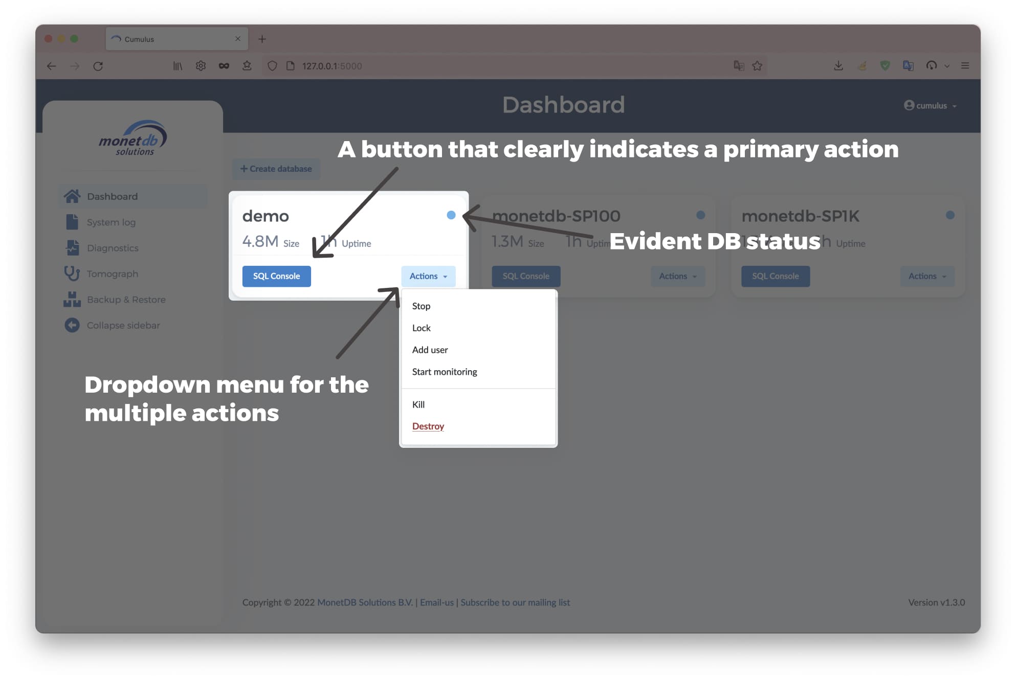
Having in mind the final user for MonetDB Cloud Interface I have performed the following improvements:
-
Definition of a User persona
-
Font and Palette definition to keep consistency
-
Specific usability improvements to simplify the usage
-
Test of the new interface with a Usability Study
The Redesign
Usability Study
This user study aims to evaluate the new dashboard with real users to understand how they interact with the interface and their cognitive responses. A total of five participants have been selected, with different backgrounds, to even out possible biases. I have chosen to use a qualitative analysis approach to directly identify the main usability problems in the dashboard, as suggested by Nielsen and Norman Group's article and by Stanton's work. The evaluation method that has been chosen is the Think Aloud protocol, largely used in qualitative evaluations, and the metrics that have been evaluated are effectiveness and usability. The data gathered has been studied and clustered through the Thematic Analysis method, which consists of reading through the scripts of the interviews and identifying patterns in meaning across the data.
The results
Overall, all the tasks were successfully completed, and people liked the application. However, some scenarios created problems for the participants. Interestingly, those scenarios were just the trigger to more significant usability problems found in the interface. After classifying the specific issues through Thematic Analysis, I have noticed a few elements as the most critical ones, that will be fixed in the next interation!
Challenges faced during the project
Among all..
Think aloud protocol limitationsEven if I have used one of the most popular methods for qualitative analysis, the Think Aloud (TA) protocol has a few limitations. Among others, I remember that this is not a “natural” method for the user and that most of the time, users comment on what they do rather than on what they think. Moreover, it is difficult for many users to interact with the program and talk about it. Lastly, most of the time, instead of having users say things as soon as they come to their minds, they reflect on their experiences and provide an edited commentary after the fact, which filters the feedback.
What I have learned
Thanks to this project, I have improved my skill in managing a redesign project from start to finish, including working with cross-functional teams and operating professionally on Git Hub.