Table comparison interface
Have you ever manually compared two tables by scanning them with your eyes?
Same here, but you won't do that again.. This project aimed to study and prototype a user-oriented tool to compare tabular data. The designed prototype will allow users to compare two different tables and discover their differences through several dedicated visualizations embedded in an organized dashboard.
Help users compare two tables easily
Project Lead, UX/UI Designer
Figma interactive prototype
Interviews, Think Aloud protocol and surveys
Let's dive into this project
Agenda
Problem statement and competitor analysis
Background researches and Pilot study with individual interviews
Low-fidelity, Mid-fidelity and final prototype with Figma
Usability Tests with Think aloud protocol and survey
The Problem
There is a lack of a ready-to-use tool that allows users to compare two tables with simple interactions and minimal effort.
Many tools offer a similar table comparison feature, but most of the time, the results are cryptic and difficult to scan.
The current market does not offer dashboards that are ready to use without any configuration or that give a general overview of the tables in a clear and user-friendly way.
In the last decades, we have seen an exponential growth of tools for visualizing data, due to the importance of data nowadays. However, when developing those tools, in order to increase the number of features and give more freedom to the users, we end up creating tools that are complex and difficult to start with, or just “overkill” for most uncomplicated use cases. One of the most known programs for data comparison and visualization is Tableau. This tool leads the business intelligence (BI) software pack with its well-designed interface and fast reports. Tableau offers an Analytical Dashboard with numerous functionalities to easily compare different tables, everything given under an intuitive Graphical User Interface (GUI). Another example is TACO, a tool that allows the visualization of the aggregated differences between multiple tables versions over time. There are a few other table comparison tools without a graphical interface such as ExcelCompare, DataComPy and Dafft.
between the previously cited tools, even if they have a dedicated interface and visualizations to display the differences among the tables, they are too distant from a dashboard that is ready to use without any configuration or that gives a general overview of the tables in a clear and user-friendly way.
Where to start?
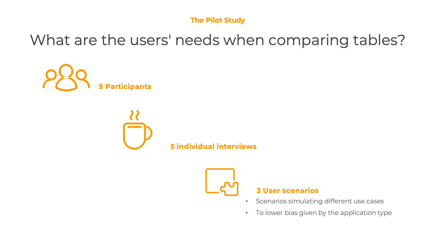
Before the generation of a possible prototype, a Pilot study was conducted to investigate what users search when comparing two different tables, which are the first things they were looking at for table comparison. The study was conducted with 5 individual interviews, so all the participants were not biased by the responses of the others. Moreover, each participant was asked to analyze three tuples of tables representing three different scenarios, thus reducing the bias given by the comparison research area.
The findings were almost the same for all the participants, and they changed mostly depending on the different scenarios. Here below summarized the things that participants would have liked to see highlighted when comparing those the set of tables:
- Trend/relation among rows/columns of the two tables
- High-level summary numbers like average and sum for each row/column
- Minimum and maximum value for each row/column
Let's solve it!
The dashboard
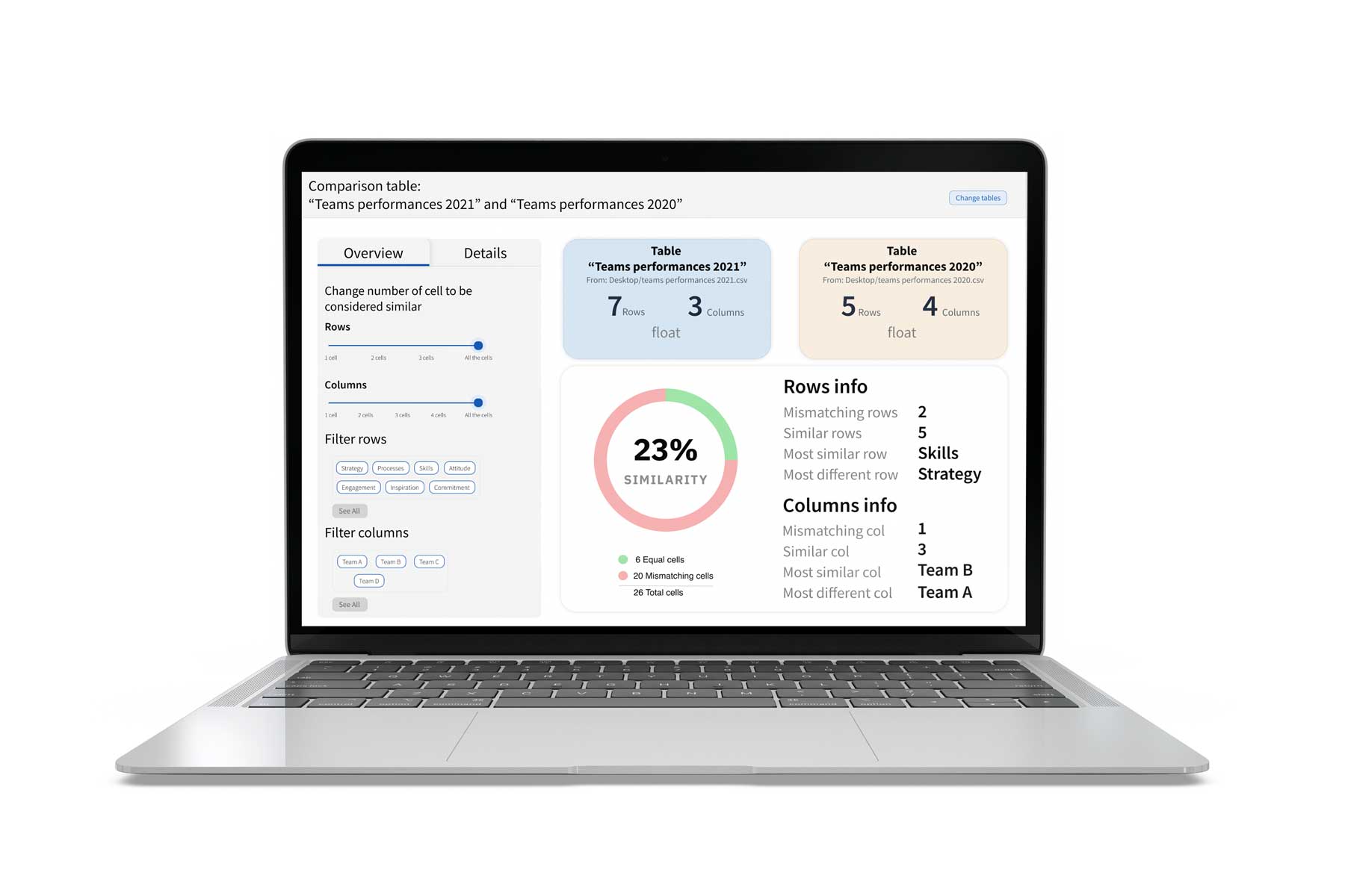
The dashboard is mainly divided into two sections. The first one presents an overview of the differences between the two tables. It is made of different information that collects the main differences between them, including the overall percentage of similarity, the number of different rows and columns, and so forth. On the other hand, the second section of the dashboard presents a detailed visualization of the differences, giving the user a specific comparison for each cell.
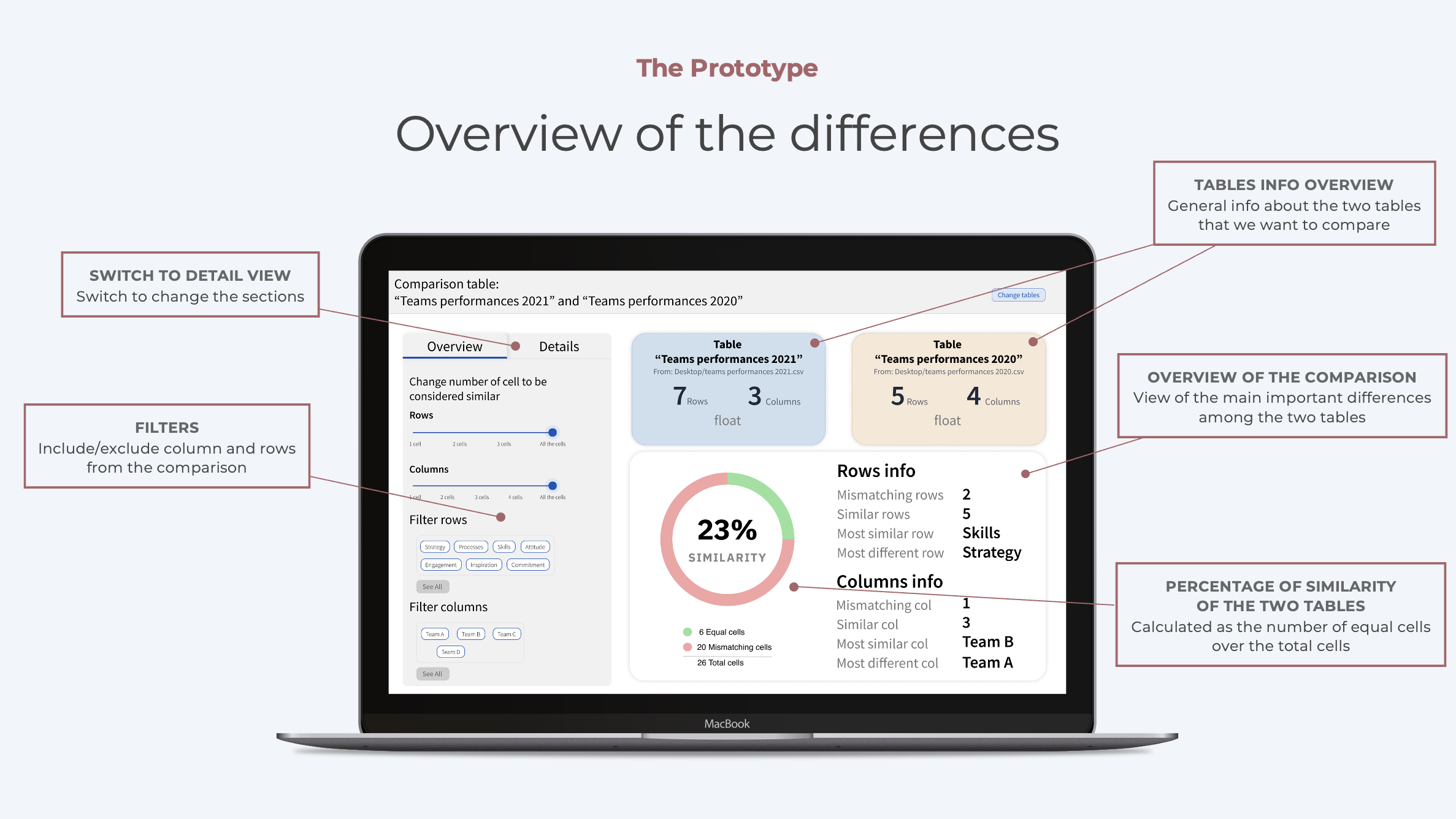
This prototype page is the first one that the user sees when opening the prototype. The overview is handy to give in a glance many “high level” information about the two tables and their relation. In particular, the two coloured boxes give an overview of the two tables selected for comparison.
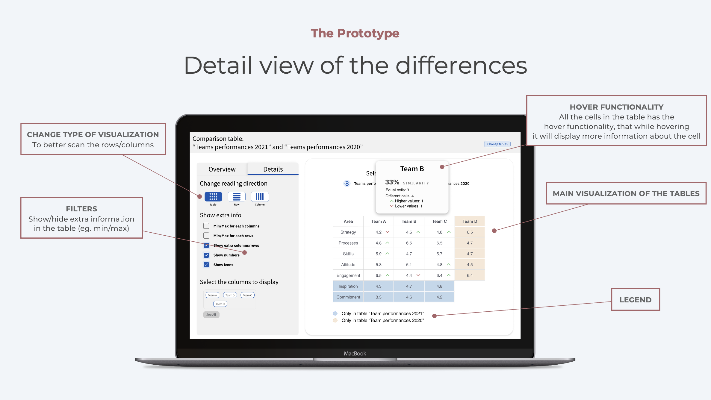
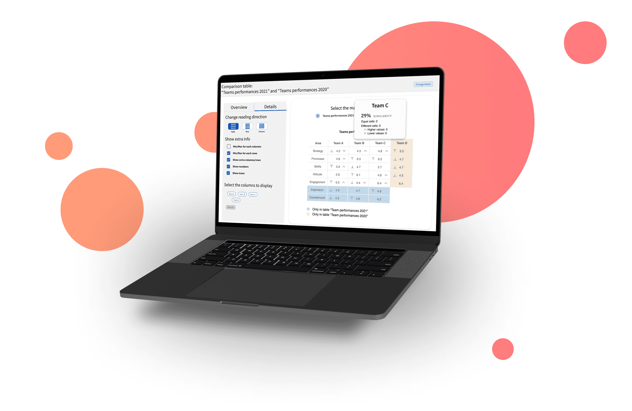
This section aims to give detailed insights into the difference between the specific cells of the two tables. One of the main rules that has always been kept in mind while designing those graphs was the Data-ink ratio.
The User Study
This user study aims to evaluate the prototype with real users to understand how they interact with the interface and their cognitive responses. A total of five participants will be selected, each with different background, to even out possible biases. I have chosen to use a qualitative analysis approach to directly identify the main usability problems in the dashboard, as suggested by Nielsen and Norman Group's article and by Stanton's work. The evaluation method that has been chosen is the Think Aloud protocol, largely used in qualitative evaluations, and the metrics that have been evaluated are effectiveness and satisfaction. The data gathered will be studied and clustered through the Thematic Analysis method, which consists of reading through the scripts of the interviews and identifying patterns in meaning across the data.
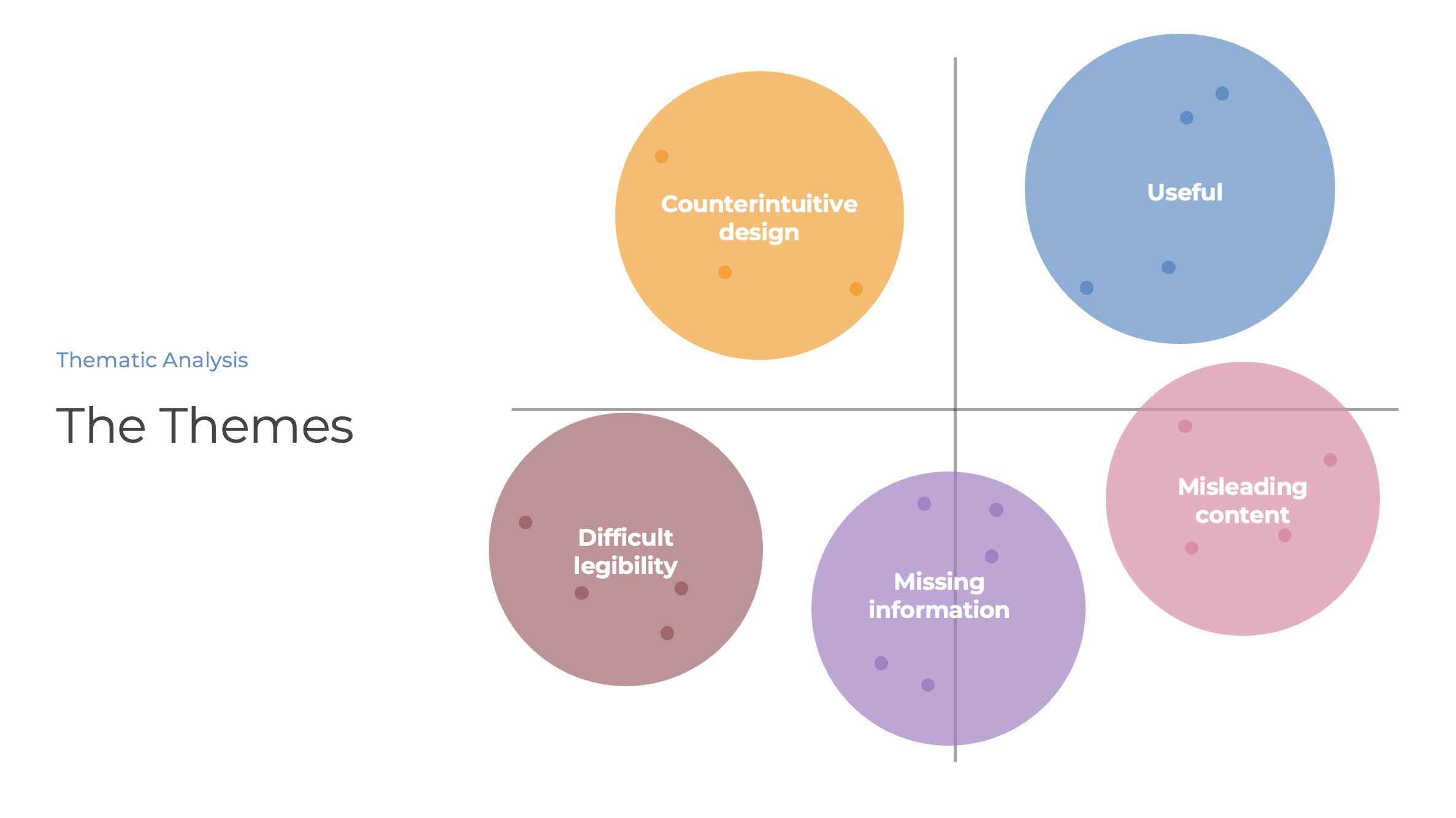
The results
The users have easily understood the designed dashboard, and the hints for focusing on the table differences have been correctly interpreted. However, some elements and information were not completely clear to the users and could be clarified and expressed in a better form.
Some feedback from the participants
The overview is really clear, and it shows the main differences at a glance
I love how the interface is exhaustive of information and clean at the same time
The button was there, but I wasn’t sure which would have been the result
Challenges faced during the project
The generalizability of the results is limited by many constraints given by the design choices of the research itself. The following paragraphs explain the main limitations of this study.
Among all..
The dashboardThe experience with the dashboard is highly influenced by the table sizes that need to be compared, and the feedback from the users could be different if asked to deal with a comparison of larger tables.
What I have learned
Thanks to this research, I have deepened my understanding of users' needs when comparing tables and how to transform them into a dashboard to compare tabular data taking a cue from the elements previously studied.